The Brief
A global medical publisher built a search engine that surfaces evidence-based content authored/published/owned by the company that had been in the market for over 10 years. The product has long been regarded as a “reference” tool because it primarily surfaces long-form content (10min+ read time, like books and full journal articles). “Reference users” like medical librarians and researchers are the main users, who value the breadth and depth of content served.
Incoming commercial research exposed an existing and growing user base of clinicians who struggled to find easily consumable digital content to support patients at the point of care (ePOC).
A business case was created for a v1 launch of the redesigned experience. Updating the main homepage look and function was prioritized as a lower-effort/lower-risk/higher-impact update.
When my family asked what I do for a living during this time, I told them that I worked on “a product that is basically Google for clinicians”.
Project Logistics
Role: UX Lead
Timeline: ~2 months during the summer of 2020
Team: cross-functional leads from product, tech, content, informatics, and commercial; a UX researcher was consulted as needed
Skills required: strategy, lean UX, mid-high wireframing/prototyping, usability testing, stakeholder engagement, presentation
Tools used: custom design system, Sketch, InVision, Optimal Sort, Zeplin, Pendo, Mouseflow
Our Problem Statement
“The current homepage does not adequately highlight the availability of our existing POC content. Our users need easy access to content that will enable them to learn, think, and act quickly and confidently so that they can provide the best possible care to patients at the bedside.
An updated ePOC homepage will need to more clearly surface POC content (shorter, more synoptic content with 2-5min read time) to better meet the needs of our clinical user base, without alienating our loyal reference user base.”
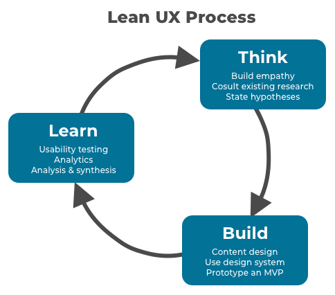
Lean UX Approach
Our stakeholders emphasized the need to get to market quickly. A POC-only tool had recently been launched in French, German, and Brazilian markets, so we knew we could leverage existing customer feedback, analytics, and insights from the recent product release.
Given the existing research and the categorization of this work as lower-effort/lower-risk/higher-impact, we framed the homepage update as an experiment facilitated by a lean UX approach.
Empathy & Understanding
Defining product use cases based on user goals
Use cases and high-level user goals were identified by the marketing research team and socialized with the product squads. This insight informed the creation of task-based proto-personas we used in ideation workshops, as well as a basic information architecture we could apply to the clinical versus non-clinical content on the homepage.
User Goals
To find a quick answer in between or during patient consultations.
To develop or confirm my patient assessment and treatment plan.
To keep abreast of the latest developments in my field of specialty.
For learning - personal learning and preparing for exams.
For teaching - teaching others, preparing lectures, and presenting cases to colleagues.
For my own clinical research.

User Pain Points
Historically, the team struggled to get stakeholder buy-in for user experience research. While we understood that some key areas of the site were problematic, we didn’t always know “the why” behind the negative sentiment we heard.
I got creative to gather user feedback and pull out insights: I learned that the marketing insights team would pull survey results from an in-app questionnaire, generating ~100 unique responses/week to multiple-choice and open-form questions. I asked to be added to the report listserv and used the data to start affinity mapping by theme and feature. This resource provided us with a heat map of pain points and greater detail behind why different experiences are perceived as unsatisfactory.
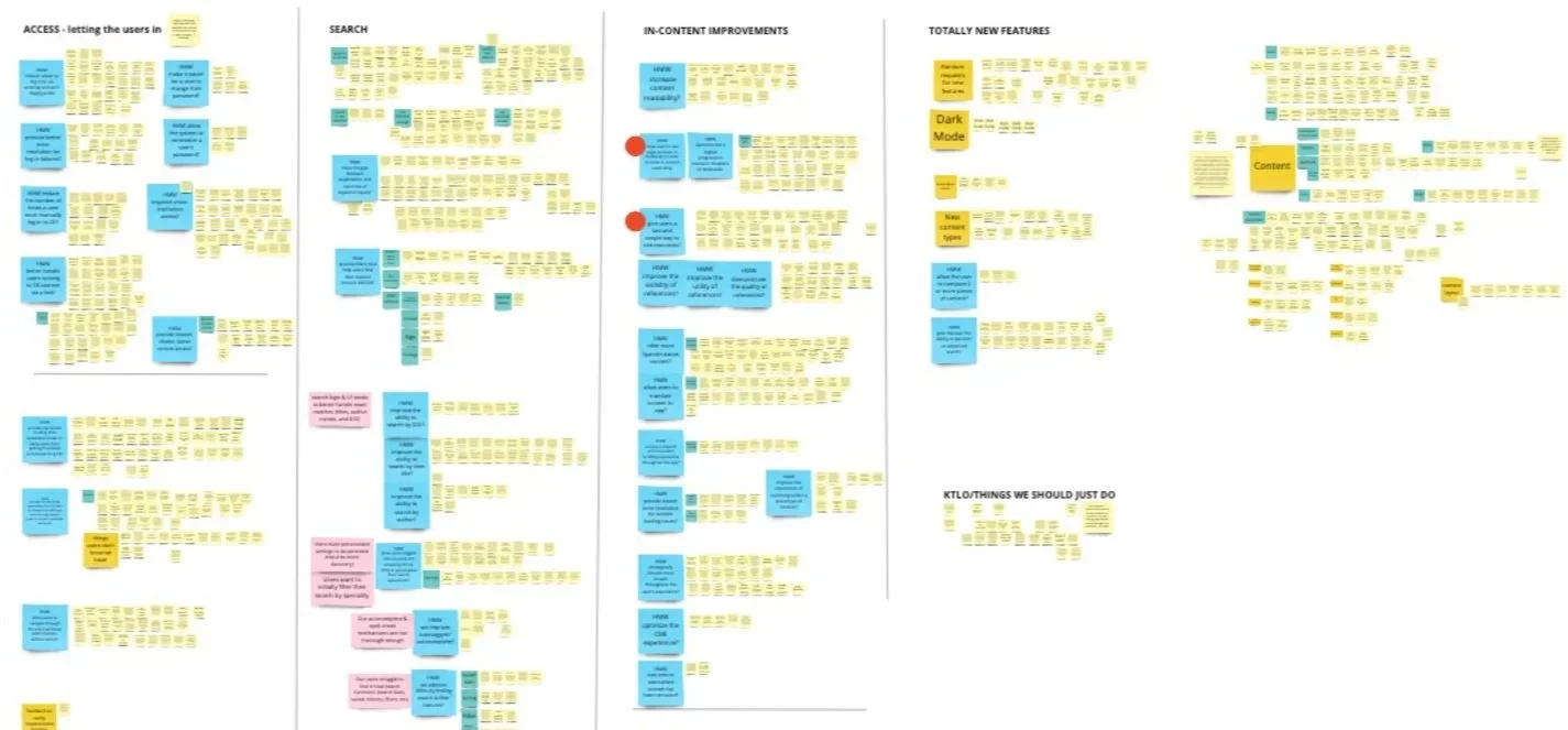
I learned the homepage could benefit from:
An easier-to-use search mechanism - knowing that an additional deeper study would be needed to investigate search further.
Clearer content labels on browsable content - to help users understand what they’d be getting into and ensure more successful clicks.
A greater variety of POC content - to achieve our goal of catering to more clinical users.
More visual content and design elements - to add character and break up monotonous content.
Our Guiding Hypotheses
Based on the evidence we gathered, I led the cross-functional team to define our hypothesis statements for the homepage redesign. This activity later helped us to measure the success of our solution.
“Highlighting POC content types on the homepage will drive higher usage of POC content and tools.”
“Highlighting POC content types on the homepage will help all user types find POC content more quickly.”
“Harmonizing the homepage experience to recognize the organic pivot points between reference AND point-of-care activities in a clinician's day will help drive clinician usage while preserving loyal reference usage.”
“Giving the impression that we have created a lot more new content without the large spend of actually authoring new content.”
“Redesigning will support the goal of our platform becoming the go-to tool of choice for clinicians and nurses, resulting in new business, higher renewal rates, and revenue growth.”
Designing, Testing, and Iterating an MVP
Content-first Design
I collaborated closely with content leads to break down the major sections of content, decide which content types are considered POC vs reference, and create brief but clear content type descriptions to create a standardized taxonomy.
Previous user feedback indicated a desire for a more visual experience. I considered how I might use iconography to help clinicians differentiate between major content types quickly. However, given the breadth of content available, the homepage could show up to 22 content types based on the customer’s subscription type, so I knew I would need to watch out for icon overload. Using too many different icons could overwhelm users and potentially increase the project cost. Product leadership agreed to let us test the new homepage to help identify and understand the usability risks of moving forward with the proposed design.
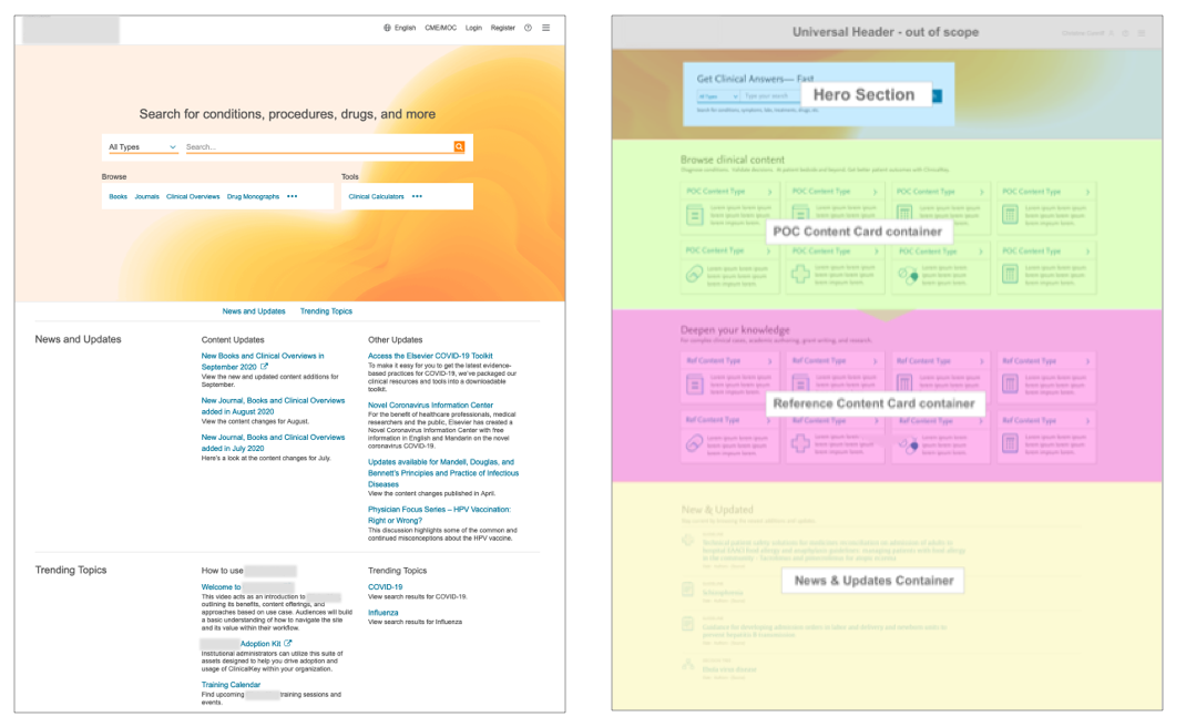
Testing the design
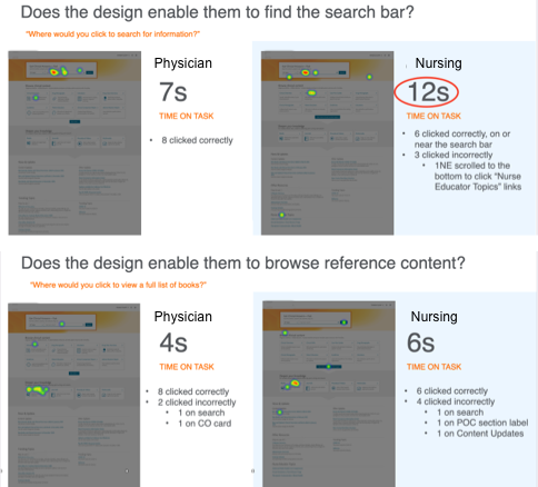
I worked with the cross-functional team to identify key questions for testing.
With support from our UX research lead, I designed and executed two unmoderated usability tests of the desktop homepage in Optimal Sort, conducted over a two-sprint period.
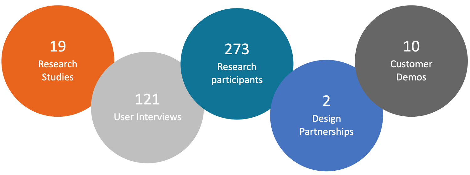
A total of 19 physicians & nurses participated, providing us with actionable insights and clear recommendations to improve our homepage experience as a high-value point of entry.
Short & long-term insights
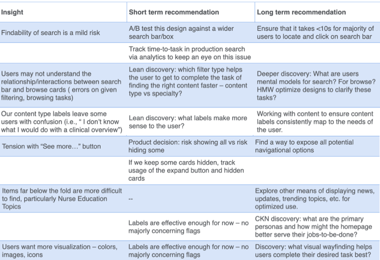
I analyzed our research feedback to articulate short-term recommendations for updating the UI and long-term recommendations for digging deeper into issues uncovered by testing.
I presented these insights and ideas to project leadership, who agreed to make the short-term changes pre-launch. The product team entered the long-term recommendations into our backlog for future iteration.
I also presented this work to the broader division-wide UX team to demonstrate how lean research helped us make fast, powerful decisions.
Iteration Plan
I applied the necessary UI updates and planned short-term research activities.
Product leadership agreed that the value achieved with iconography would not be worth the risk or the resource spend, so I removed the icons from the content cards.
I made the “show more“ buttons larger and more descriptive to drive usability and actionability.
I worked with our tech leads to design A/B tests and success metrics for different homepage functionalities.
I worked with the content team to craft a tree test of content labels to generate more intuitive, user-friendly content-type naming.
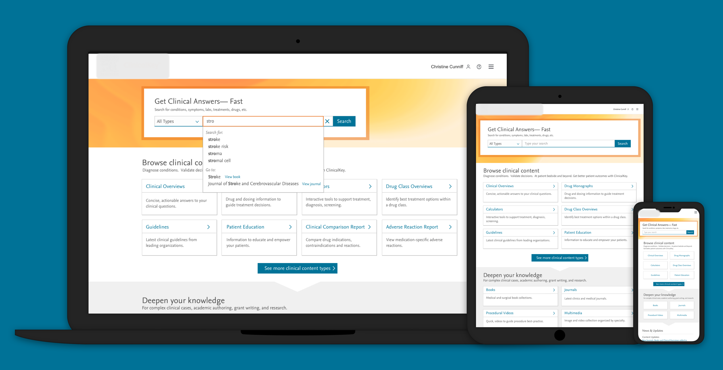
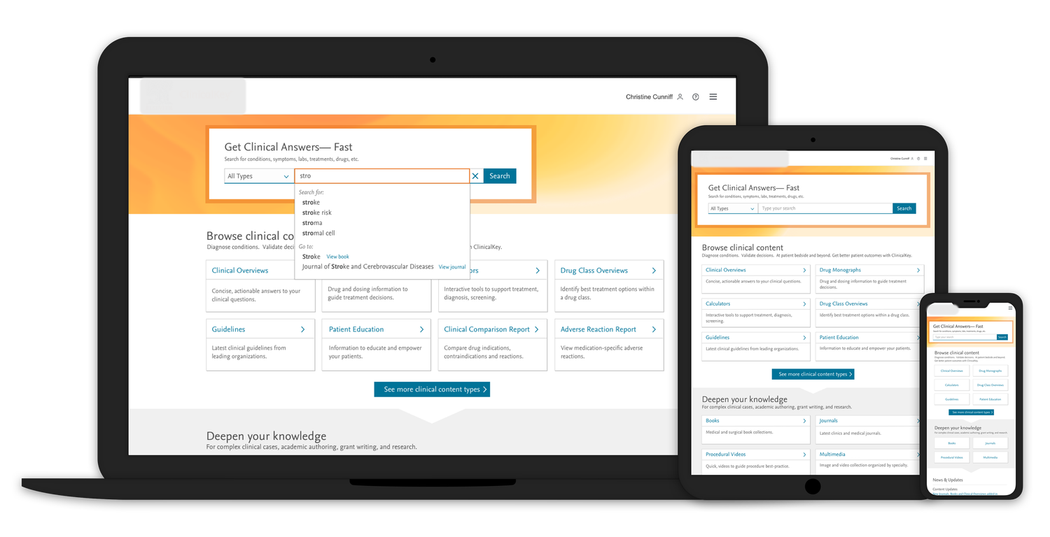
With the knowledge gained from this research, I mocked up the final views of the responsive UI on desktop, tablet, and mobile devices (shown below). I shared these designs with the dev team via Zeplin and supported their efforts with design QA.
Project Outcomes
Early Feedback
Early qualitative feedback from demos with the company’s board, existing buyers, and new customers tells us that we are heading in the right direction with the homepage redesign:
“[the tool’s] real strength is in the content…I’m glad that when I do scroll down, I see 'Deepen your knowledge'."
“Definitely a more user-friendly experience.”
“You all must be very excited about the improvements and we can certainly see why.”
“[We] would very much like to ‘relaunch’ [the site] across [our organization].”
A long-serving company board member stated that he had not seen so many impactful improvements to the product “in the last 8 years.”
Since launch, we have also been gathering more quantitative feedback from user interviews, in-app surveys, and usage metrics from analytics:
Bounce rates from first-click content have decreased from 30% to 27.5%, allowing us to set a new goal of getting down to 20%.
Clinical Overview (our primary synoptic content type) views per week have grown from 9,500 to 24,000.
Content utility ratings increased from 75% to 82%, helping us to establish a new goal of 89%+.
Commercial Wins
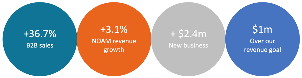
The launch of the v1 redesign has allowed us to close new sales, expand site-to-system deals, and offer renewal upgrades for existing customers.
Here are some exciting commercial stats that show the impact of our work:
Process Wins
While it’s been quite exciting to see the impact the launch has had on the market and the business, I walk away feeling most humbled to have been a part of a team that brought so much momentum and energy into the product teams.
The homepage redesign work contributed to a massive 440%+ increase in user research over the year. As stakeholders have been exposed to the positive commercial impacts of the work we accomplished given access to user research, we’ve seen a cultural shift in how UX work is regarded on this project.