The Brief
Transitioning from development to UX work, I decided to pursue a more structured UX education. I enrolled in an immersive online program through CareerFoundry’s UX School to expand my knowledge and skills.
In the main section of the course, students choose between 3 project options. I chose the Expert app concept: “enable anyone, anywhere to instantly chat with an expert in virtually any field.”
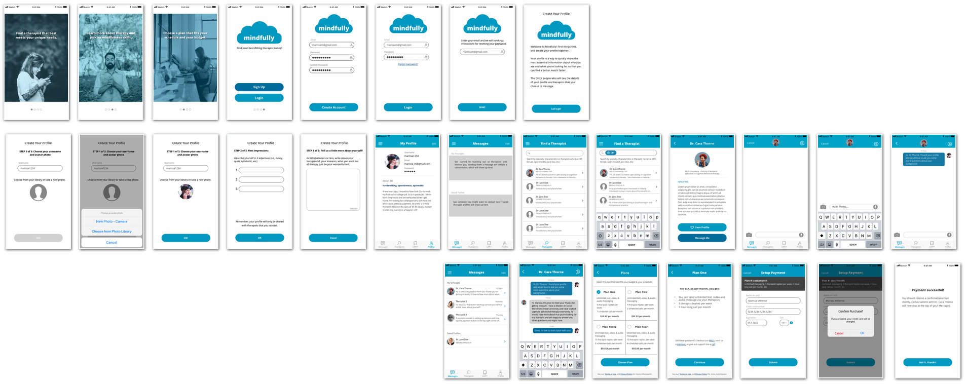
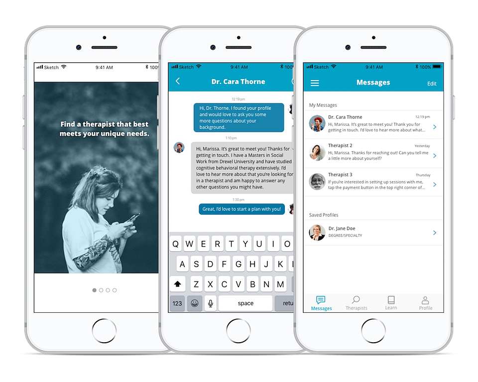
Considering barriers people face when trying to access mental health resources, I chose to design Mindfully, a communication tool that helps people find and connect with a therapist that truly suits their needs - anytime, anywhere.
The Approach
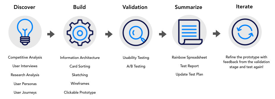
I used a design thinking approach because I needed to quickly work out possible solutions for an MVP, and then keep building, measuring, and learning from my iterations.
A leaner process helped me to prioritize identifying the most important features of the app and to clarify how they would need to work together to create a useful end product.
Discovery & Empathy
Competitive Analysis
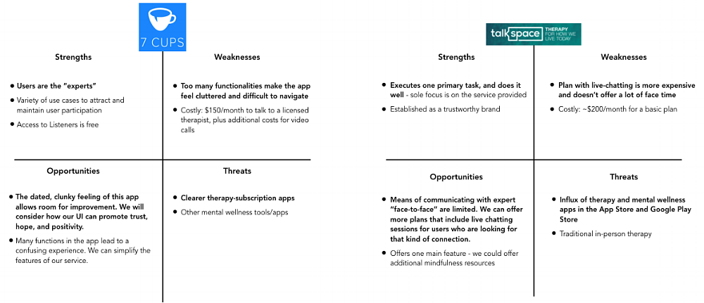
I analyzed two primary competitors - 7 Cups and Talkspace - creating a SWOT analysis for each company. This analysis exposed an opportunity for a therapy app solution that is simpler, more approachable to end users, and incorporates holistic mindfulness resources.
Problem Statement & Hypothesis
Problem Statement: Our users need a way to connect and communicate with licensed therapists of various specialties, because they need to be able to access high-quality therapy services from anywhere.
Hypothesis: We believe a mobile app that allows users to find and connect with remote therapists will help reduce obstacles to mental health care and will translate to a more empowering experience than our competitors currently offer.
Understanding the Problem
I started planning for user interview sessions by establishing my learning goals:
What do I already know?
There is an existing market for therapy and mindfulness apps
There are a variety of types of therapy that people seek in-person (psychotherapy, cognitive behavioral therapy, music therapy, etc)
People have many different kinds of experiences with in-person therapy - positive, neutral, and negative
Barriers like cost, time, and geographical location reduce people’s access to mental health care
What do I need to know?
Users’ thoughts and feelings about therapy apps
Pain points users have experienced with in-person therapy
What elements of their physical environment make them feel calm and comfortable
What traits they seek when looking for a new therapist
Talking to Users
Initially, I chose 3 interviewees - two of whom had never used therapy apps, and one who had.
I looked for participants who had experiences with therapy themselves, or as a part of their job/studies.
Interviewee #1: 29 years old, female, Sociology student at University of Maryland
Interviewee #2: 35 years old, male, former social worker, currently working at a food co-op in San Fransisco
Interviewee #3: 29 years old, female, owner of a vegan bakery, Talkspace user
What are the leftover unknowns?
If people were interested in trying out different therapists before purchasing a subscription
How current Talkspace users feel about their experience - why did they choose Talkspace? Are they fulfilled? Are they unsatisfied?
All of the interviewees had tried in-person therapy in the past. They each spoke to positive and negative experiences, but maintained belief therapy’s helpfulness.
Interviewees 1 and 2 expressed hesitation about therapy apps - they were more comfortable with in-person experiences than sessions via screen.
Interviewees 1 and 3 were very transparent about their wants, needs, and expectations of a therapist, while Interviewee 2 had less of an idea of what he would want to look for in a therapist.
Interviewee 3 is a current Talkspace user and spoke very highly of her experiences using the app.
After my initial interviews, I realized that my understanding of the problem with current therapy app solutions would be better illustrated if I spoke to another current therapy app user, so I found Interviewee #4: 31 years old, genderqueer, hairdresser, new Talkspace user.
From the Talkspace users (interviewees 3 and 4) specifically, I learned that:
They both have demanding jobs with erratic schedules.
They both talked about coming from a generation where talking to strangers on the internet was commonplace - they had both developed meaningful relationships behind screens using tools like AIM (AOL Instant Messenger).
They are both very open to trying out different types of therapy methods.
They both self-identify as being “non-traditional” and are hesitant about judgmental therapists.
High-level Takeaways
All four participants:
Had experience with therapy before this interview - therapy is common within the key demographic.
Expressed interest in learning about or engaging in different types of therapies.
Took a surprisingly long time to think about question # 5 (“What are some personality traits that make you feel comfortable opening up to someone?”). It felt like the type of person they’d be talking to is very important to them.
Wanted to be engaged by their therapist - to feel listened to, challenged, and respected.
Described anonymity as being less important.
Other key takeaways:
There is an existing population that is actively excited about therapy apps.
Time, money, and access are common barriers to accessing therapy.
There is still concern about the “person-to-person” connection, though each participant had positive experiences with phone therapy in the past.
Therapy apps are a relatively new concept - there may not be a lot of word-of-mouth communication about them yet.
Personas & Journey Maps
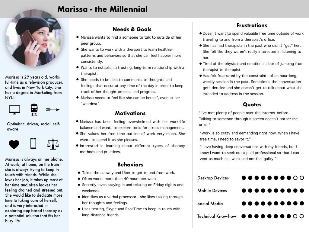
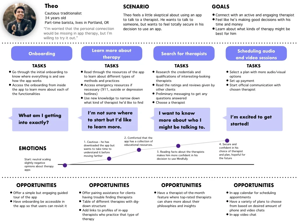
Marissa the Millennial represents the primary user of Mindfully - she grew up on the internet and is no stranger to communicating via a screen. This persona is based on direct feedback provided by current therapy-app users. She is my primary persona and my guiding light.
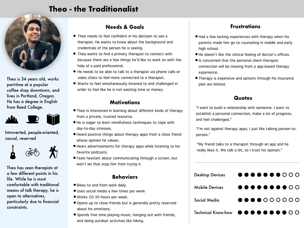
Theo the Traditionalist has tried traditional therapy in the past but feels unsatisfied by the results - he is a great target for conversion to app-based therapy. He was created based on feedback from users who were more skeptical of therapy sessions via phone or screen.
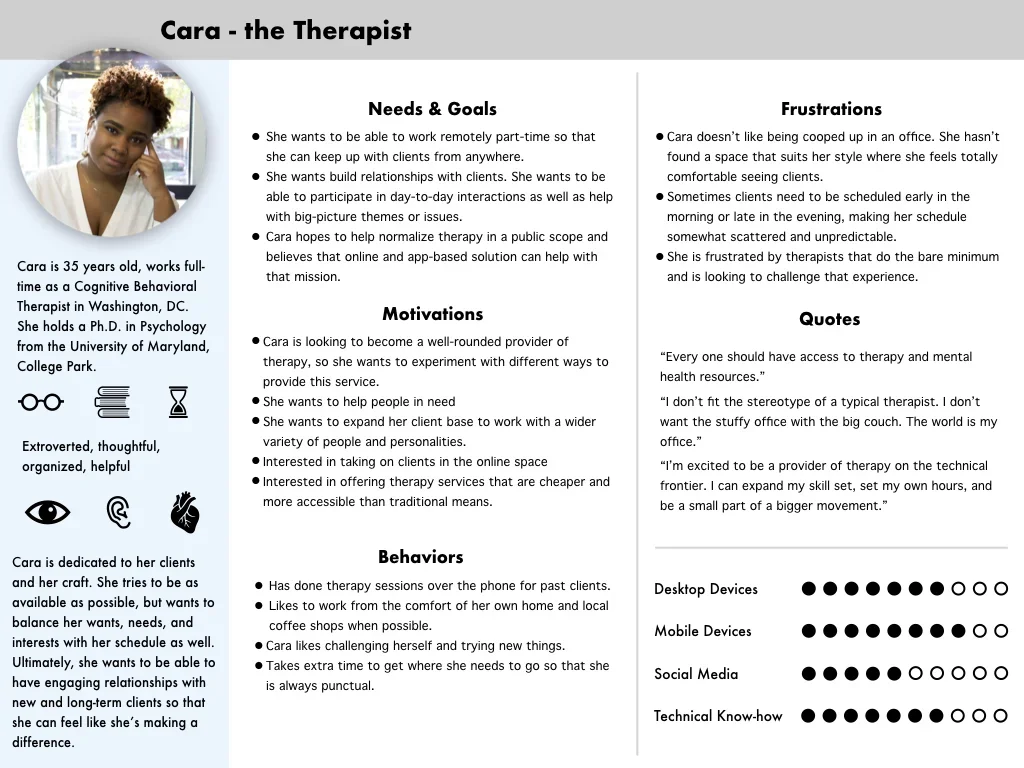
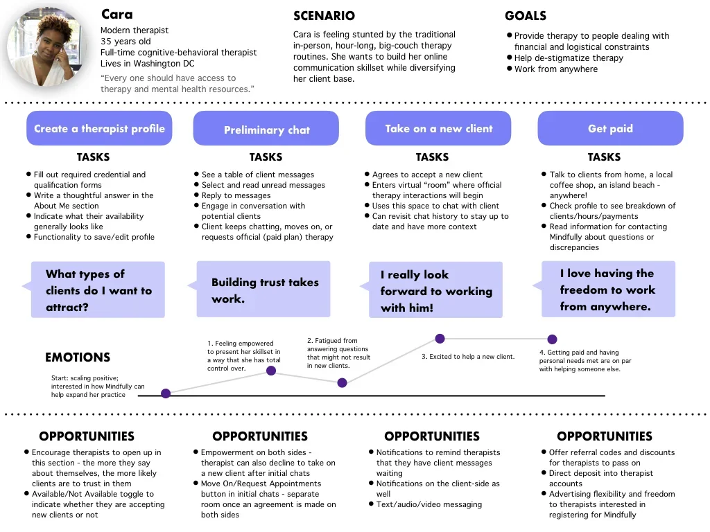
Cara the Therapist represents a therapist with characteristics described by interviewees. She is engaging, responsive, and respectful of her clients.
User Flows
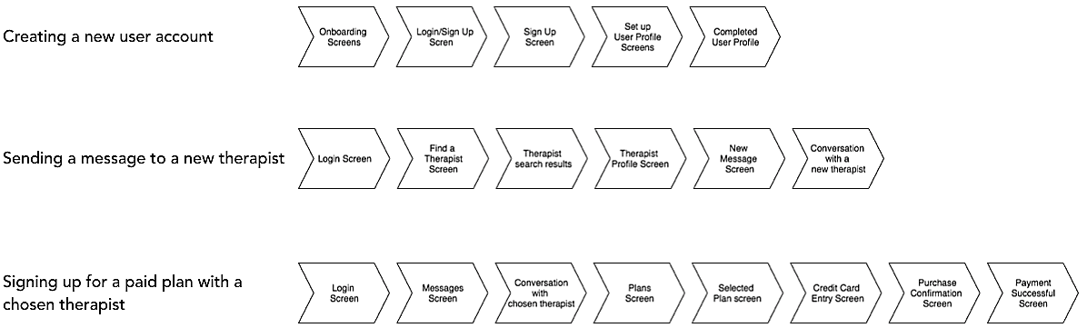
I analyzed tasks that could be completed in the app from the perspective of Marissa Millennial. I then created user flows to start fleshing out the necessary steps and screens it would take to complete basic these tasks.
Building the experience
Making an Information Architecture
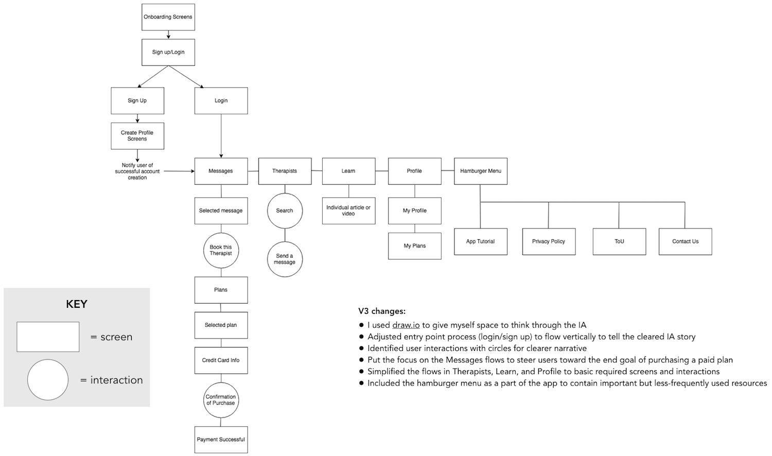
Originally, I used Keynote to make the Information Architecture (IA) for Mindfully. My first few versions of the IA didn’t feel totally accurate, so I played with reorganizations of the content.
After a consultation with my mentor, I decided to try Draw.io and follow a more interaction-based framework. This was a much better tool for the job!
Iterative Wireframes
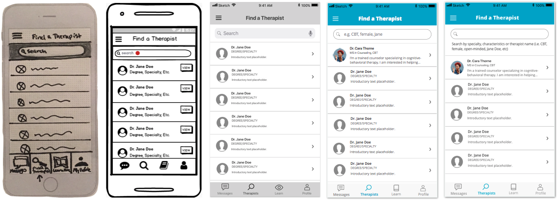
My first ideation sketches for user flows were (very) quick and dirty, with a Sharpie and graph paper, but the designs progressed in clarity and fidelity with iterative wireframes. Mindfully is in part a tool for easing stress, so its interface needed to stay minimalistic with each iteration.
Validation
Putting Nav to the A/B Test
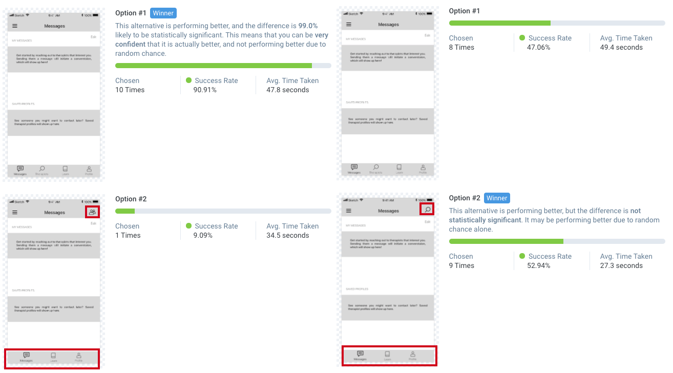
I used A/B testing to see if users prefer the “search therapists” icon in the tab navigation or if a simple icon in the top-right corner would be more intuitive.
I ran two A/B tests because test #1 had changes to the icon and its location. This offered too many variables for judgment, so I ran a second test with the same search icon but in a different location.
In total, 17 people participated in the second preference test. Option # 2 had a slightly higher success rate by one vote, which was not enough of a difference to be statistically significant. I choose to stick with the navigation of option # 1. The icon, placement, and text from option # 1 will add more clarity for new users who could benefit from more context.
Usability Testing
With a high-fidelity prototype in hand, I recruited 6 participants for my usability testing. Four sessions happened in person, and two were conducted remotely. I asked participants to complete direct and scenario tasks using Mindfully.
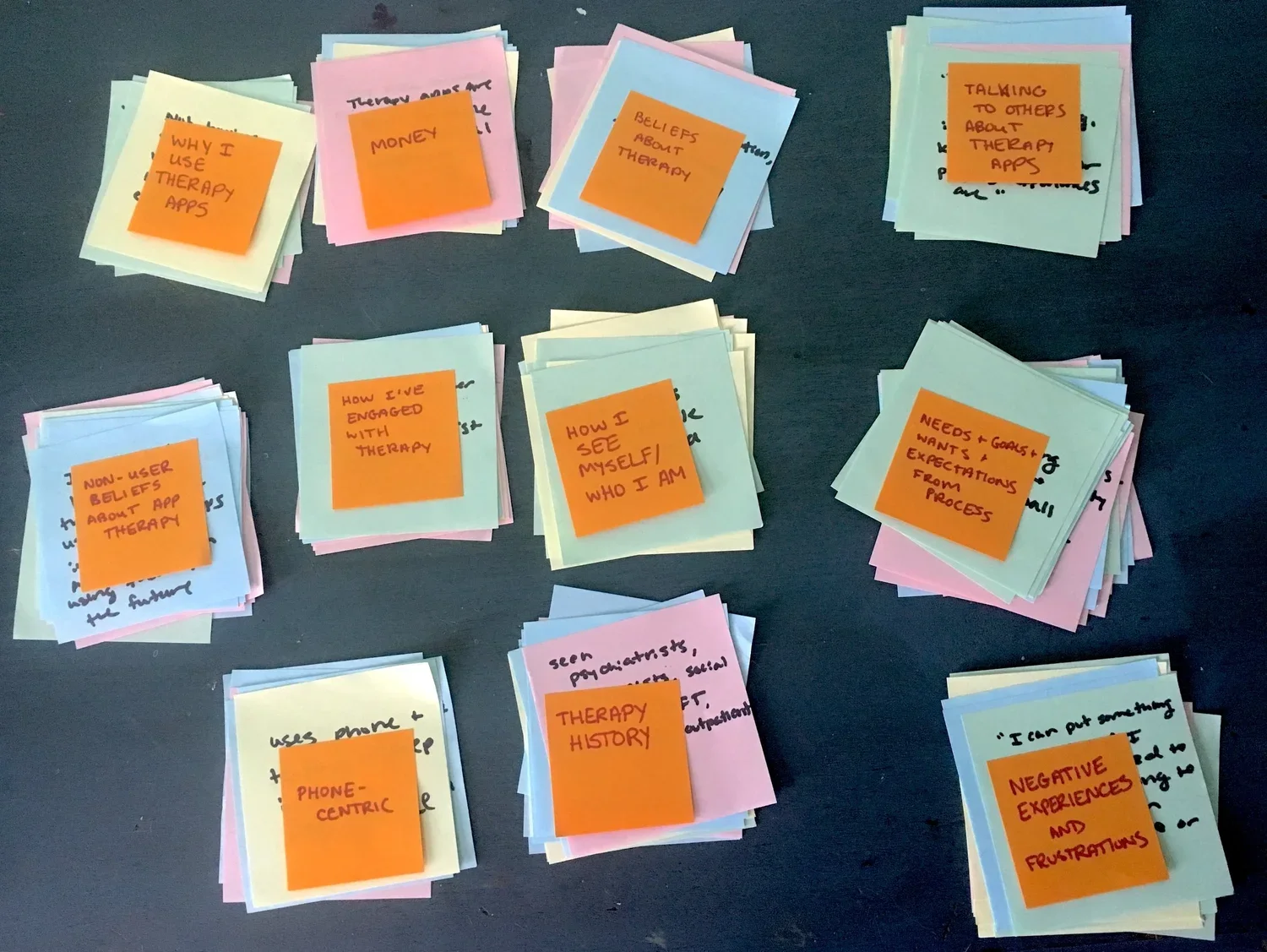
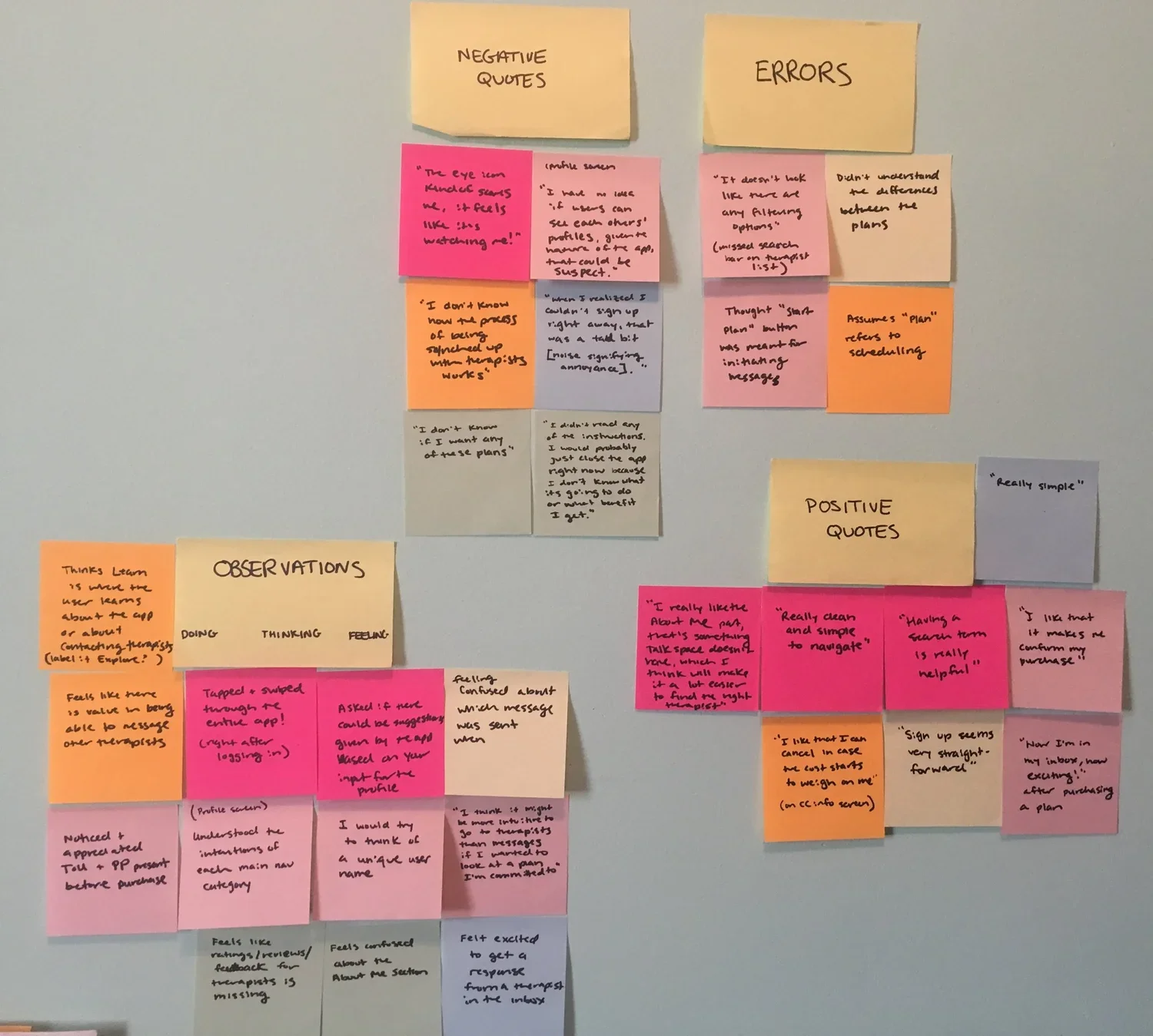
After all of the sessions were completed, I analyzed the feedback with an affinity map and a rainbow spreadsheet. Mapping the frequency of errors helped to inform a more formal test report that outlined and ranked the top issues that arose during testing and offered suggestions for possible remedies.
I learned that my top 5 usability issues were:
Relationship with therapist is unclear (high priority)
Confusion about what to put in the profile (high priority)
The difference between the plans is unclear (medium priority)
Search functionality is not clear (low priority)
“Start Plan” button is unclear (low priority)
Feedback-driven Iterations
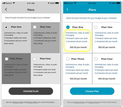
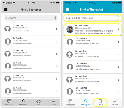
I made changes to my wireframes to resolve the errors and address the negative feedback from my usability tests.
Peer Critique
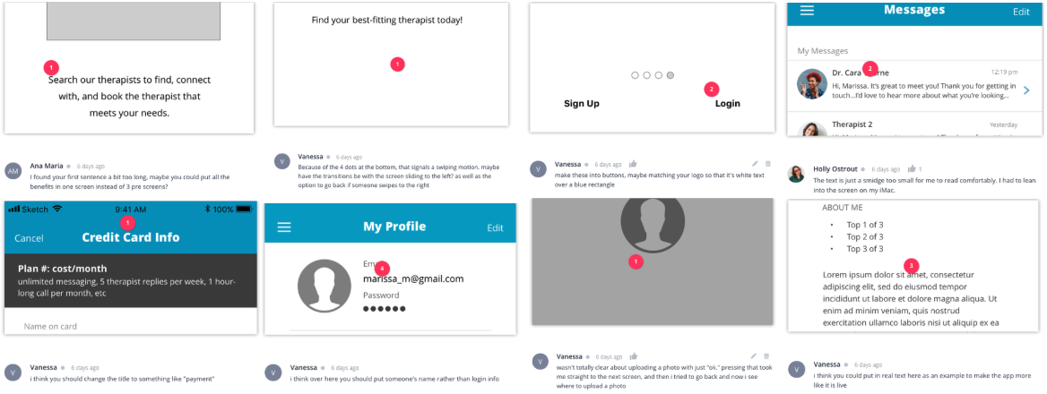
I invited 5 fellow UX designers to peer review Mindfully via comments in InVision.
Out of 25 comments, I chose to address the top 8 based on project scope and impact.
I used this feedback to iterate again, making a series of UI updates to make the design more consistent, readable, and realistic.
Accessibility Audit
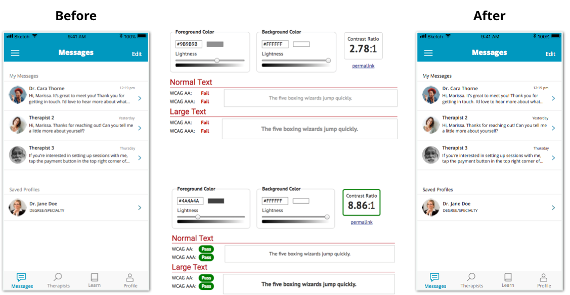
I completed an accessibility audit of my designs and made a number of updates to support a more usable experience for all.
Font size
Color contrast
Preferred interactive components
Clear, non-disappearing directions
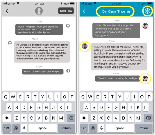
Issues 1 & 5: Relationship & plan
Added clearer copy to show a relationship example
Labeled the chat to give the user more context
Included images to show who was talking
Replaced the "start plan" text button with an icon
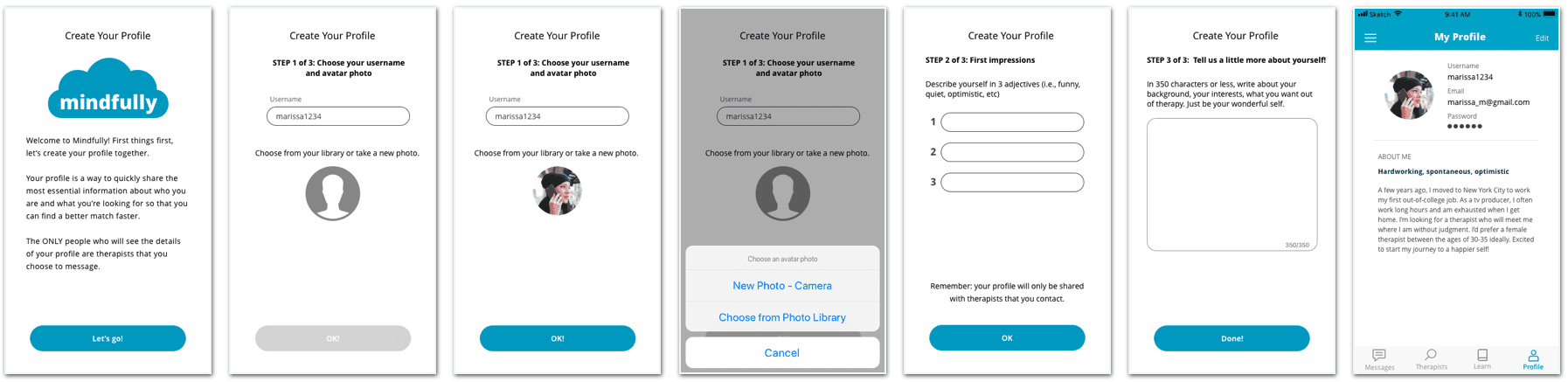
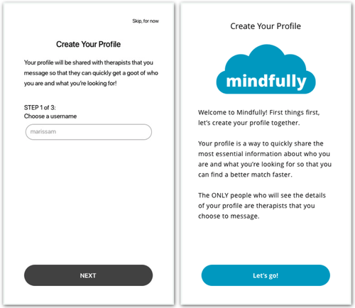
Issue 2: What goes in a profile?
Separated the introduction to profile creation from step 1
Improved copy to guide and inform the tester/user
Addressed privacy concerns by clarifying when/with whom user profiles are shared
Issue 3: Plan breakdown
Gave more description about each plan to show the points of difference
Increased the visibility of the instructions
Issues 1 & 4: Relationship & search
Added copy to the first cell to give the tester/user a better idea of what therapists do and how they are presented
Added placeholder text to the search bar to guide the user’s search process
Conclusion
Thank you for viewing the process behind Mindfully! Check out the current prototype in Figma.